The strongest stand exhibition design does one job well: it tells a passing visitor who you are and why to step in, within seconds. For most exhibitors that means a clear layout, one message, and one feature that stops people walking. A single-message minimalist stand (idea 1) suits small budgets and first shows. A bold feature wall (idea 3) suits crowded halls. A lit overhead structure (idea 5) suits large exhibitors who need visibility across the hall. Interactive and storytelling stands (ideas 7 and 8) suit brands with products that need explaining, and modular systems (idea 9) suit anyone who exhibits several times a year.
The problem with most inspiration pages is that they show finished stands without saying why they work. A photo tells you little about how to adapt the idea to your own floor space, show rules, and team. You end up with a folder of pretty images and no design decision.
This article gives you 12 ideas covering creative, modern, and simple approaches. Each one explains how to build it and who it suits, with the watch-outs that show up on the show floor. A final section helps you choose and combine them. Exhibition Globe works with organizers, exhibitors, and stand contractors across the trade show industry, so the advice is framed around how a stand performs at a show, not how it looks in a render.
1. One message and one hero element
A simple exhibition stand design commits to one message and one hero element, and nothing competes with them. It is the most reliable starting point when budget or floor space is tight, and it is easier to staff and easier to remember than a busy stand.
How to build it
Write your message in eight words or fewer, then place it where a visitor can read it from the aisle. Choose one hero: a product on a plinth, an oversized logo, or a single graphic wall. Gaggenau is a good model. Its stand used one illuminated logo outside and a partly hidden interior that made people look further. Keep the palette to two colors plus black or white.
- Keep counters low so the hero stays visible from the aisle.
- Leave clear floor space at the front so visitors can step in without feeling committed.
- Use one typeface and one graphic style on every surface.
Who it suits and what to watch
First-time exhibitors, shell-scheme stands, and brands with one clear hero product get the most from this approach. If you can explain your offer in a sentence, you can design this stand.
Simple is not the same as empty. A flat wall with a weak print looks unfinished, not minimal, so spend your money on finish quality and lighting rather than on extra elements. The test is whether a stranger can say what you sell after two seconds.
Simple does not mean empty: every element on the stand has to earn its place.
2. Bold color and contrast
Bold color is the fastest creative exhibition stand design move, because color is read from the aisle before any text. Pick two strongly contrasting colors and let one dominate the structure.
How to build it
Deutsche Telekom showed how far two colors can go. It used white and fluorescent pink, both of which reflect light, and the stand glowed in a crowded hall. Silverline took a quieter route, pairing two contrasting colors with grey countertops and floor panels to build depth. Copy the logic: a dominant color for the structure, a contrasting accent for the hero, and a neutral for everything else.
- Carry the main color onto the floor, furniture, and staff apparel.
- Order a printed fabric sample and check it in similar lighting, because screen colors shift on fabric.
- Keep the accent to a small share of the surface so it still reads as an accent.
Who it suits and what to watch
Brands with a recognizable color, such as consumer, fashion, and design companies, gain the most. So do exhibitors in halls where every neighbor uses white and grey.
Check your brand guidelines before you push a color to its limit. Neon across a large area tires the eye, and some shows control flooring, so confirm carpet rules before you plan a colored floor.
In a hall of white stands, color is the cheapest way to be seen first.
3. A feature wall that carries the stand
Exhibition stand wall design is where most stands win or lose, because the back wall is the largest surface visitors see from a distance. Treat it as your hero, not as a place to stack logos.
How to build it
Choose the wall treatment by what it has to do. Bebece’s stand used movable wooden boards, so the exhibitors could refresh the look during the day and open or close the stand when it got busy. That is an extreme case, but the principle holds: the wall should work, not just decorate.
| Wall treatment | Works best for | Watch out for |
|---|---|---|
| Large fabric graphic | Clear messages, easy swaps between shows | Wrinkles if tension is poor |
| Wood slats or panels | Premium or craft brands | Weight and freight cost |
| Backlit fabric or lightbox | Product-led stands in dim halls | Power supply and heat |
| Moss, plants, or textured panels | Wellness, food, sustainability | Upkeep and fire ratings |
| Screens or video wall | Demos and changing content | Glare and weak content |
| Movable boards | Stands that open and close | Complex build |
Who it suits and what to watch
Every exhibitor needs a back wall, so this idea fits any stand with one. In-line stands commonly have a back wall around 8 ft (2.4 m) high, but check the exhibitor manual for your show.
Put your headline and logo above head height. When the stand is busy, the lower third of the wall disappears behind people. A feature wall also needs one idea, not three, so choose a single texture or graphic and commit.
Design the wall for the busiest hour of the show, when half of it is hidden by visitors.
4. Lighting-led design
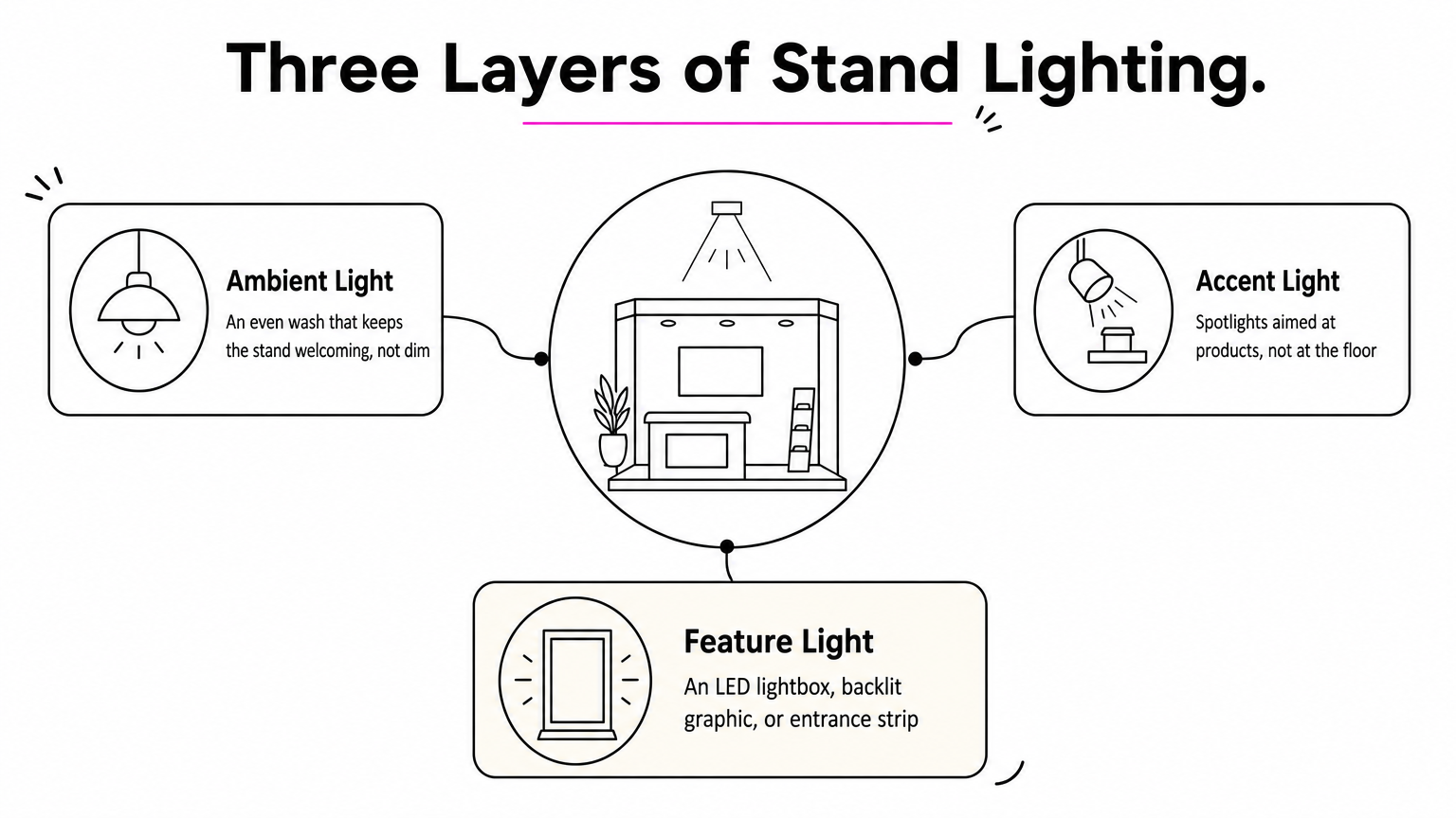
Lighting-led design turns a plain structure into a landmark, and it is the most efficient upgrade in modern exhibition stand design. Three layers do the work: ambient light, accent light on products, and one feature light.
How to build it
Hyundai’s stand at the Geneva motor show laid lengths of linear light into the floor to suggest movement. Gaggenau lit a recessed wall with halo linear lighting and a mirrored back panel to put full focus on its products. You do not need those budgets to apply the same logic. Light the product first, then the logo, then everything else.
- Ambient: an even wash so the stand feels welcoming, not dim.
- Accent: spotlights aimed at products, not at the floor.
- Feature: an LED lightbox, a backlit graphic, or a strip outlining the entrance.
- Keep screens out of direct spotlight to avoid glare.
Who it suits and what to watch
Product-heavy brands such as jewelry, furniture, appliances, and ceramics benefit most. It also helps any stand in a hall with dim aisles.
Plan power early. Most shows sell electrical supply through the organizer or an official contractor, and orders placed late often cost more. Add up your total load before you order, and favor LED fixtures, which draw less than older halogen lamps.
Light the product first, the logo second, and nothing else needs to shout.
5. Overhead and hanging structures
A hanging structure gives your stand visibility above the crowd, which is the one thing a packed floor cannot take away. Many exhibitors never design the space above their stand, so using it sets you apart.
How to build it
Gantries and hanging banners add shape and a three-dimensional effect, and they work especially well on island stands. A simple version is a lightweight modular frame wrapped in aluminum composite panels with LEDs set inside. Make the text large enough to read from across the hall, and print on both sides.
- Put your logo, not a long tagline, on the overhead element.
- Use lightweight frames to keep rigging simple.
- Integrate LED strips so the structure also lights the stand below.
- Match the colors to your back wall so the two read as one design.
Who it suits and what to watch
Island stands, large halls, and stands in back rows get the highest return, since people look for landmarks when they navigate.
Rules decide what is possible. Many organizers restrict hanging signs by stand type and height, and rigging is often done only by the official contractor at an extra fee. Read the exhibitor manual before you finalize the design, not after.
Read the hanging-sign rules before you design the sign.
6. Open 360-degree island layouts
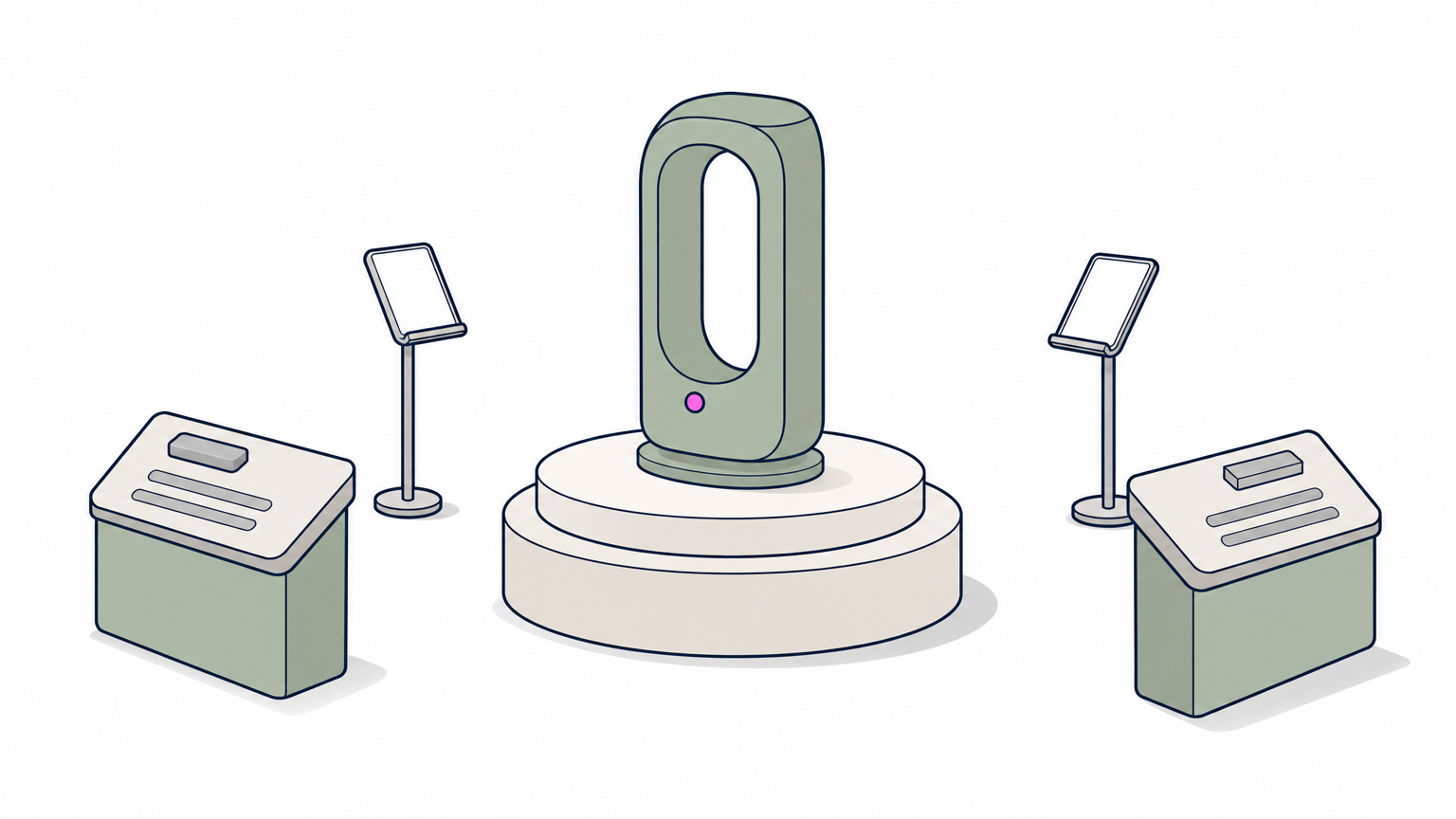
A 360-degree layout removes the back wall and invites visitors from every side, which suits island spaces with aisles on all sides. The stand is a destination people can walk around.
How to build it
Place your hero product or message in the center so it is visible from every direction. Keep barriers to a minimum, because an open layout invites people to wander in and engage. Use the edges for lead stations such as tablets, where visitors can be caught as they pass.
- Raise the hero on a plinth or platform so it clears the crowd.
- Group storage and any closed rooms into one central block.
- Offer at least two clear entry points.
- Angle counters to the aisles instead of lining them up in a wall.
Who it suits and what to watch
Larger exhibitors, product launches, and brands with a striking hero object suit this layout. A car, a machine, or a sculptural display works well in the middle of the floor.
You lose the back wall, so your graphics must work on pillars, overhead structures, and counters. You also need staff facing every side, because an unstaffed side looks closed. Plan shifts so each side has someone ready to greet.
With no back wall, every side of the stand has to look like a front.
7. Interactive and digital experiences
Interactive technology gives visitors something to do instead of something to read, which is why touchscreens, VR, and AR keep appearing in modern exhibition stand design. Doing beats reading on a busy floor.
How to build it
Airbus built a stand around VR pods that placed viewers in three airspace environments. VR also solved a logistics problem, because its equipment would have filled the hall. It used several pods rather than one or two, so taking part never felt awkward. Siemens added screens that live-streamed users in its custom VR system, so onlookers saw what happens before they tried it.
- Run several stations so nobody queues for long.
- Mirror each experience on a large screen for the crowd.
- Keep the experience short and finish with lead capture.
- Prepare an offline fallback in case the network fails.
Who it suits and what to watch
Equipment makers, software companies, and anyone selling something too large or complex to ship benefit most.
Technology fails at the worst time. Show-floor Wi-Fi is unreliable, so run demos from local files wherever possible. Train your team to guide the experience, because a screen without a person beside it is easy to walk past.
Show the demo to the crowd, not only to the person wearing the headset.
8. Storytelling environments
A storytelling stand builds the environment your product lives in, so visitors understand it by walking through it. It is the strongest route when your exhibition stand design concept needs emotion as well as information.
How to build it
Montblanc’s booth at SIHH housed its collections in a spherical wooden cage structure, with watchmakers working in the center to show the craft behind each watch. The Yo’Hood stand for Herschel Supply took log cabins as its inspiration, with a timber frame, mirror-clad columns, and slats painted with natural scenes to tell the brand’s Canadian background. Both put a human or a place at the heart of the stand.
- Write the concept in one sentence before you design anything.
- Limit the stand to three main materials.
- Put products in the hero positions, not in the background.
- Add a human element, such as a craftsperson or a host.
Who it suits and what to watch
Heritage, craft, and lifestyle brands, and companies launching a new collection, use storytelling well.
Do not let the theme bury the product. A beautiful stand that leaves visitors unsure what you sell earns compliments and loses leads. Put a clear headline and your product category on the exterior, even if the interior is pure atmosphere.
A stand tells a story only if visitors can still tell what you sell.
9. Modular and reusable systems
A modular system is the practical modern answer for exhibitors who attend repeat shows: one kit of frames, panels, and graphics that reconfigures for different stand sizes. It lowers the cost of every show after the first.
How to build it
Design a core kit around a standard module, such as 10 x 10 ft (3 x 3 m), that combines into larger footprints. Change only the graphics between shows, and add one custom signature element, such as a lit logo or a feature counter, so the stand does not look generic.
- Check that every panel, frame, and counter fits your largest and smallest stand size.
- Print graphics on swappable fabric or panels.
- Budget for storage and freight as well as the build.
- Consider renting a stand for a one-off show, which gives you a fresh design without ownership.
Who it suits and what to watch
Exhibitors who attend several shows a year, switch between stand sizes, or work to a fixed budget get the best return.
The risk is a look that resembles everyone else’s kit. A single custom element fixes that. Also count storage honestly, because a reusable stand that sits in a warehouse and costs more to freight than to rebuild is not saving money.
A modular kit pays off only when you actually use it at several shows.
10. Natural materials and sustainable builds
Natural and recycled materials give a stand warmth and a sustainability story, and they are a strong current in modern exhibition stand design. Wood, jute, paper, and moss all read as human in a hall full of vinyl.
How to build it
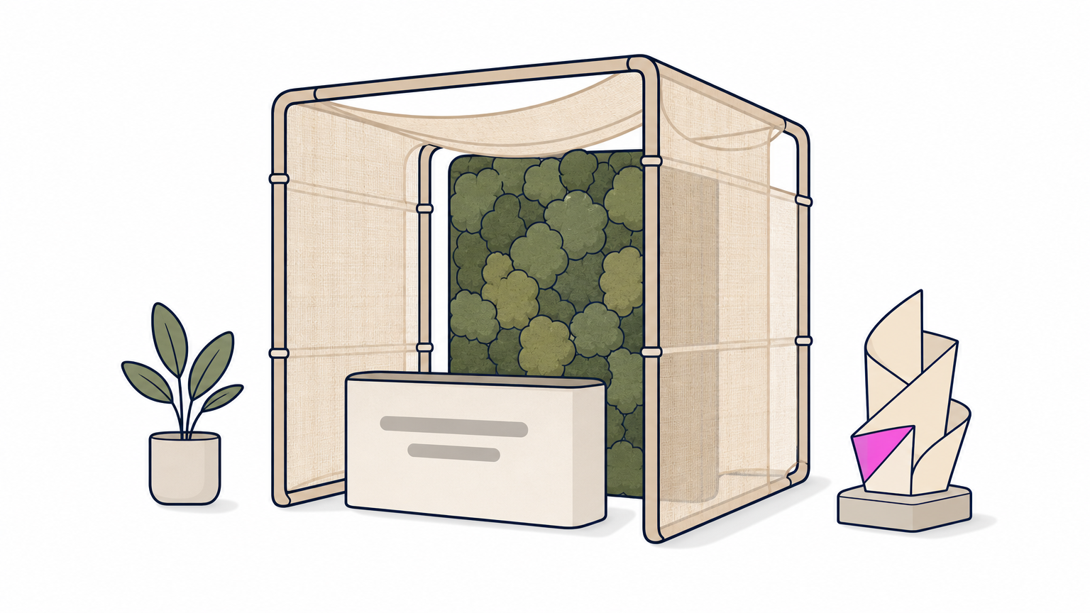
Examples show the range. One stand used pallet-style wood panels on a white exterior. SET Architects used biodegradable jute cloth on a thin frame, with enough translucency that passers-by could see the screens inside. Penda’s modular concept used recyclable metal with plants on the roofs, and MIDO’s Milan stand was a sculpture of 2,200 pieces of paper. Pick one dominant material and let it carry the design.
- Pair a natural material with clean white or black to keep it sharp.
- Specify parts that can be reused or recycled after the show.
- Ask for fire-retardant certificates on fabric and wood.
- Test finishes for wear from transit and handling.
Who it suits and what to watch
Eco-conscious, craft, food, furniture, and design brands fit naturally.
Venues often require flame-retardant treatment for fabrics and materials, so confirm the rules early. If sustainability is your message, plan the afterlife of the stand too. A recycled stand that is thrown away after one show undercuts the story.
A sustainable stand has to survive more than one show to be believable.
11. Semi-private meeting areas
A semi-private meeting area adds the interior design layer that turns a display into a place for business conversations. The aim is visual openness with enough calm to talk.
How to build it
Hilton used semi-transparent acrylic walls, which let it put branding on the exterior without compromising privacy once a visitor sat down. Enercon built a two-tier stand with meeting areas in abundance and privacy where it mattered. Tejas Borja stepped back slotted wooden beams and placed solid graphic panels at its entrances to mark them clearly. Think in terms of a visible, welcoming edge and a quieter core.
- On a 10 x 10 ft stand, a small table with two chairs takes roughly a quarter of the floor, so choose it over a full room.
- Use partial-height screens or translucent panels rather than solid walls.
- Place seating away from the aisle edge.
- Plan power outlets for laptops and tablets.
Who it suits and what to watch
Sales-led exhibitors, consultants, and companies selling high-value deals need this idea most.
A closed meeting room blocks sightlines and can make passers-by think the stand is closed. Keep one clear element visible from the aisle, such as a lit logo or a staffed reception counter, so the stand still looks open for business.
Give meetings privacy without making the stand look closed to everyone else.
12. Live demo stages and hospitality bars
A live demo stage or refreshment bar gives people a reason to stop and a reason to stay, and it is the simplest way to add energy to any stand. Food, drink, and demonstrations create natural conversation openings.
How to build it
Announce specific demo times, post the schedule on the stand, and use screens to show close-ups so the crowd sees every detail. A branded drink, a barista, or a chocolatier at work turns refreshments into part of the show. Put the stage at a corner facing the main aisle with space for an audience, and place the bar at the edge of the stand.
- Print the demo schedule on a visible panel.
- Recess the stage so a crowd does not block the aisle.
- Use screens for close-ups of the demo.
- Rotate staff so someone is always free to talk after each session.
Who it suits and what to watch
Food, consumer product, and equipment brands do well, since the product can be tried or watched.
Check the venue rules on catering, food sampling, and sound levels, because many venues have exclusive caterers or noise limits. Crowd control matters too, since a successful demo that blocks the aisle will bring complaints from neighbors and the organizer.
A demo works best when the crowd has somewhere to stand that is not the aisle.
How to choose and combine these ideas
Choose by goal first, then space, then budget, and combine no more than two or three ideas on one stand. Stands that try everything read as cluttered.
Match the idea to your goal
| Main goal | Lead with | Add |
|---|---|---|
| Brand awareness in a big hall | 5 Overhead structure, 2 Bold color | 4 Lighting |
| Leads and conversations | 11 Meeting area, 7 Interactive | 3 Feature wall |
| Product launch | 8 Storytelling, 12 Demo stage | 4 Lighting |
| Tight budget or first show | 1 Single message, 9 Modular | 3 Feature wall |
| Several shows a year | 9 Modular, 10 Natural materials | 2 Bold color |
Check size, rules, and cost before you commit
Work out your floor area first. A 10 x 10 ft stand is 100 sq ft, so a meeting table, a counter, and a hero product already fill it. A 10 x 20 ft stand gives 200 sq ft, enough for a small demo corner or a feature wall plus a meeting area. Pick ideas that fit the space instead of shrinking a large concept.
Cost depends on stand size, custom fabrication versus modular parts, lighting and AV, graphics, freight, installation labor, and show-specific fees such as electrical, rigging, and flooring. Ask any stand builder for an itemized quote so you can see which idea costs what. Then brief your designer with one line on your goal, one on your hero, and the exhibitor manual attached.
Choose the goal first, and the right design idea usually follows.
Pick one idea and build around it
The best exhibition stand design is rarely the most elaborate one. It is the one with a single clear message, a hero element visitors can see from the aisle, and a layout that suits the way your team talks to people. Start with the idea that fits your goal and space, add one supporting idea, and test the plan against the exhibitor manual before you pay for anything.
If you build stands, design booths, or exhibit often, share your work and news with the people who follow the industry. You can publish a press release, an interview, or a business listing with Exhibition Globe and put your stand in front of organizers, exhibitors, and buyers.